Why Visual Consistency Matters More Than Individual Image Quality
A single impressive image on your LinkedIn feed does less for your brand than a consistent series of moderately good images that all feel like they belong together. Visual consistency creates brand recognition — the moment when a follower sees your content in their feed and knows it is yours before they read a single word. That level of recognition requires repetition, not perfection.
The brands with the strongest visual identity on social media are not necessarily those with the largest design budgets. They are the ones that have made deliberate choices about a small number of visual variables — colour, style, composition — and applied them consistently across every piece of content they publish. That consistency is achievable with AI image generation tools, provided you build the right system around them.
Defining Your Visual Style Specification
The foundation of visual consistency is a written visual style specification — a document that defines the exact parameters for every image you create. This document functions like a creative brief that you apply to every AI image generation session, ensuring that outputs across different topics, creators, and time periods all look like they come from the same brand.
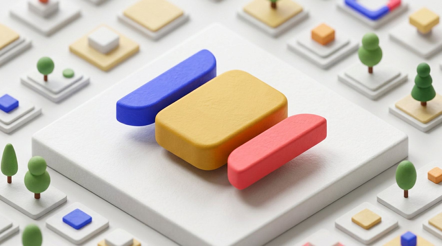
Your visual style specification should cover: background treatment (colour, gradient, or environment), lighting style (soft diffused, dramatic directional, natural), primary object style (photorealistic, stylised 3D, flat graphic, abstract geometric), colour palette (primary brand colour plus one or two accent colours), and composition style (centred single object, rule-of-thirds, pattern or texture). Write this specification down and treat it as a constraint on every image you generate.
- Background: e.g., "seamless white or light cream studio background, no texture"
- Lighting: e.g., "soft three-point studio lighting, subtle shadows, no harsh directional light"
- Object style: e.g., "clean 3D CGI, smooth surfaces, geometric forms, no organic or natural shapes"
- Colour: e.g., "primary: deep cobalt blue (#3838FF), accent: warm gold, no other colours in the palette"
- Composition: e.g., "single central object with generous negative space, 16:9 landscape format"
Building a Master Prompt Template
Once you have your visual style specification, convert it into a master prompt template — a reusable prompt structure where you only change the subject of each image while keeping all the style parameters constant. This is the most practical tool for maintaining visual consistency at scale.
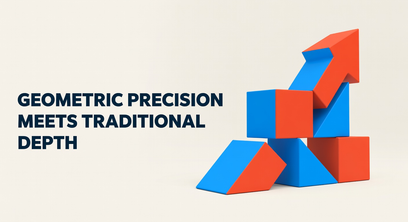
A master prompt template looks like this: "[SUBJECT DESCRIPTION]. Style: clean 3D CGI, [BRAND COLOUR] colour palette, smooth geometric surfaces, white seamless studio background, soft diffused studio lighting, single focal point, ample negative space, 16:9 landscape format, professional product photography aesthetic, no text, no people." You fill in [SUBJECT DESCRIPTION] for each image and keep everything else identical.
Test your master prompt template across ten different subjects before committing to it. If you get consistent visual results across different topics — a blog post about data security, a post about team management, a post about quarterly results — then the template is working. If the outputs feel disconnected, adjust the style parameters until the consistency holds across diverse subjects. See How to Use AI to Create Professional Social Media Images in Minutes for the prompting fundamentals.
Adapting Your Style for Different Platforms
Visual consistency does not mean identical images across platforms — it means the same visual language applied appropriately to each platform's format requirements. Your LinkedIn landscape image and your Instagram square image should look like they are from the same brand even though they are different sizes and may show different subjects.
The key is to define your visual style at a level of abstraction that survives format changes. "Clean 3D CGI geometric objects on a white background with cobalt blue accents" is a style that works in 16:9 landscape for LinkedIn, 1:1 square for Instagram, and 9:16 vertical for Stories. The specific composition adjusts for the format, but the visual language remains constant.
See The Right Image Sizes for Every Social Media Platform in 2026 for the platform dimension reference you will need when adapting your images across channels.
Workflow: From Concept to Multi-Platform Consistency
A practical workflow for consistent multi-platform imagery starts with generating one master image at your highest required dimension (typically 1920 x 1080px landscape), then cropping and adapting it for each additional platform format. For most content, you will need a landscape version (LinkedIn, Twitter/X), a square version (Instagram feed), and potentially a vertical version (Stories, TikTok).
Batch this work. If you are creating content for a week, generate all the landscape images first using your master prompt template, then crop the set for square and vertical formats. Batching reduces the context-switching cost of moving between platforms and helps you maintain style consistency because you are reviewing all the images at once rather than in isolation.
Auditing Your Visual Consistency
Periodically audit your social media feeds for visual consistency. Look at your last 12 posts on LinkedIn, your last 12 on Instagram, and your last 12 on Twitter/X. Do they look like they come from the same brand? Does the colour palette appear consistent? Does the image style — photographic, illustrative, 3D — remain constant?
If there is significant visual drift — which is common when multiple team members are generating content or when a new tool was adopted partway through the period — identify when the drift started and what caused it, then update your visual style specification and master prompt template to address the source of inconsistency. Regular audits catch drift early, before it becomes a significant brand coherence problem.